
Science, like the rest of human life, is subject to fashions. Data visualisation is the latest trend: policy-makers and the public are all under its charm, and researchers magically suspend their disbelief — give me a fancy image, and I won’t look too closely at your p-values. So I was intrigued by the discovery, at a talk few days ago by Paul Jackson of the Office for National Statistics, that there are precedents, and that they have a long history behind them.
The story is that of John Snow, an epidemiologist who was persuaded, against the received wisdom of the mid-nineteenth century, that cholera does not propagate through air but through contaminated water or food. But how to convince others? When cholera struck London in 1854, Snow began plotting the location of deaths on a map of Soho: he represented each death through a line parallel to the building front in which the person died.
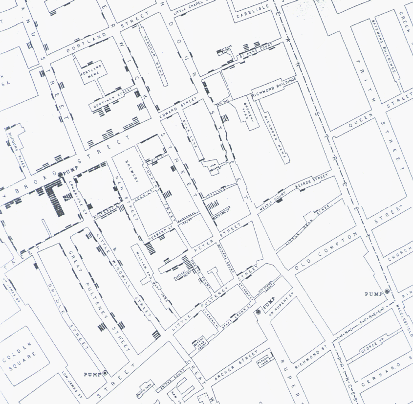
Snow soon realised that there was a concentration of “death lines” around Broad Street — more specifically, around a water pump at the corner between Broad and Cambridge St.

He managed to convince the authorities to remove the handle of the pump, so that people could no longer use it: in a few days, the number of deaths in the area plummeted. Snow had proven his point and saved lives: using no medical trials, no sophisticated chemistry, just with some basic count statistics, and a clever dataviz.

1 Comment