Data visualisation is still relatively uncommon in the social sciences, and is not normally expected to be part of the standard work of a scholar (contrary, some would say, to what happens in the sciences, where visualisation is sometimes necessary to figure out the properties of objects whose existence is proven, but which cannot be seen). Yet data visualisation has an extraordinary history of accomplishments even in the social realm, as cleverly documented in a forthcoming article by James Moody and Kieran Healy; and classics such as Pierre Bourdieu valued it and attempted to use it in at least some of their work, as Baptiste Coulmont interestingly reported in a blog post.
Yet the digital age offers new opportunities for data visualisation, that are largely unexploited in the social sciences. It becomes not only a tool for the researcher — to explore data prior to conducting statistical analyses, or to present results once the work is done — but also for the general user, the study subject, the beneficiary of any policy under discussion, and the general public. As theorists in the arts and digital humanities (but not much in the social sciences, I am afraid) have noticed, the Internet and all digital infrastructures are becoming today interfaces with databases, and users of all types are immersed in a world of data in a way that was unknown before. This means that data visualisations can have new and more transformative uses, empowering study subjects and people in general, by offering them intuitive and aesthetically appealing tools to better navigate this digital world. But it also involves new dangers, as to who sets the agenda and what aspects or characteristics of the data are being stressed; data are not just objective, ‘raw’ materials but mediated ones, and the choice of how to make them perceptible by the senses is not neutral.
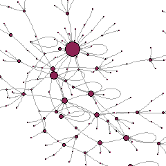
At the annual conference of the British Sociological Association today in Leeds, in the Methodological Innovations Stream, I am presenting data visualisation work I have done with colleagues Antonio A. Casilli, Lise Mounier and Fred Pailler, as well as data visuliaser Quentin Bréant, as part of the research project ANAMIA. We developed three tools — one for data collection, one for data exploration and preliminary analysis, one as a basis for heuristics and presentation of results. The first was for our study subjects, the second for us researchers and our colleagues, the third for us and the larger public. My slides are available:

