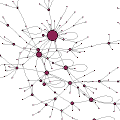
With a group of colleagues from Universitat Autònoma de Barcelona and in Collaboration with OuiShare, we are studying networking at the event. The OuiShare Fest aims, among other things, to bring people together: we want to see how interactions between participants facilitate circulation of ideas and possibly give rise to future collaborations.
I’m so excited that earlier this month, I ran the second wave of data collection for my Sharing Networks research project at OuiShare Fest 2017!
The study aims to map the collaborative economy community that gathers at OuiShare Fest, looking at how people network and how this fosters the emergence of new trends and topics.
During the event, a small team of committed and effective co-researchers helped me interview participants. We used a questionnaire with a “name generator” format, typically used in social network analysis to elicit people’s connections and reconstitute their social environment.
Specifically, we asked respondents to name people they knew before the
Results of our Sharing Networks 2016 survey have now become a T-shirt.
OuiShare Fest, and met again there (“old friends”), and people they met during the Fest for the first time (“new contacts”). Then we asked them to choose, from among the “old” and “new” they had named, those they would like to contact again with soon, for example for joint projects or collaborations.
I am very happy with the result: 160 completed interviews over three half-days! But it is still not enough: participants to the Fest were much more numerous than that, and in social network analysis, it is well-known that sampling is insufficient, and one needs to get as close to exhaustiveness as possible.
Therefore, for those OuiShare Fest 2017 participants that we did not manage to interview, there is now an opportunity to complete the questionnaire online.
If you were at the Fest and we did not talk to you, please do participate now! It takes less than 8 minutes, and you will help the research team as well as the organization of the Fest.
Many thanks to the team of co-researchers who helped me, the OuiShare team members who supported us, and all respondents.
More information about the Sharing Networks study is available here.
Highlights from results of last years’ Sharing Networks survey are available here.
This article was first published on Discover Society, November 2014.
Last June, a group of Italian MPs proposed jail terms and fines for authors of so-called “pro-ana” (anorexia) and “pro-mia” (bulimia) websites. These are self-styled online communities on eating disorders which are viewed as promoting extreme dieting and unhealthy eating practices. France and the United Kingdom preceded Italy’s attempt to pass restrictive legislation as far back as 2008-9, and many internet service providers also endeavoured to ban these contents.
But the potential spread of health-hazardous behaviours is probably only one side of the coin, and these websites might also channel health-enhancing assistance, advice, and support (Yeshua-Katz & Martins 2013). In fact a closer look reveals that website users carefully manage their online socialisation to address their health challenges. Online social spaces enable discussion around the illness and constitute a complement, albeit an admittedly imperfect one, to formal healthcare services. There is no rejection of standard health norms in the name of some extreme ideal of thinness but rather a need – or perhaps, a cry – for extra support.
A social science approach brings out these results. The effect of web interactions on health does not only depend on website contents, but also on how people actually use them, share them, and access resources through them. The social, rather than just clinical dimension of eating disorders, recognized long before the advent of the web (Bell 1985, Orbach 1978), becomes ever more relevant in the current context and calls for a more comprehensive view of the “ana” and “mia” social universe.
Data visualisation is still relatively uncommon in the social sciences, and is not normally expected to be part of the standard work of a scholar (contrary, some would say, to what happens in the sciences, where visualisation is sometimes necessary to figure out the properties of objects whose existence is proven, but which cannot be seen). Yet data visualisation has an extraordinary history of accomplishments even in the social realm, as cleverly documented in a forthcoming article by James Moody and Kieran Healy; and classics such as Pierre Bourdieu valued it and attempted to use it in at least some of their work, as Baptiste Coulmont interestingly reported in a blog post.
Yet the digital age offers new opportunities for data visualisation, that are largely unexploited in the social sciences. It becomes not only a tool for the researcher — to explore data prior to conducting statistical analyses, or to present results once the work is done — but also for the general user, the study subject, the beneficiary of any policy under discussion, and the general public. As theorists in the arts and digital humanities (but not much in the social sciences, I am afraid) have noticed, the Internet and all digital infrastructures are becoming today interfaces with databases, and users of all types are immersed in a world of data in a way that was unknown before. This means that data visualisations can have new and more transformative uses, empowering study subjects and people in general, by offering them intuitive and aesthetically appealing tools to better navigate this digital world. But it also involves new dangers, as to who sets the agenda and what aspects or characteristics of the data are being stressed; data are not just objective, ‘raw’ materials but mediated ones, and the choice of how to make them perceptible by the senses is not neutral.
At the annual conference of the British Sociological Association today in Leeds, in the Methodological Innovations Stream, I am presenting data visualisation work I have done with colleagues Antonio A. Casilli, Lise Mounier and Fred Pailler, as well as data visuliaser Quentin Bréant, as part of the research project ANAMIA. We developed three tools — one for data collection, one for data exploration and preliminary analysis, one as a basis for heuristics and presentation of results. The first was for our study subjects, the second for us researchers and our colleagues, the third for us and the larger public. My slides are available:
Uh, it’s been a while… I should have written more regularly! All the more so as many things have happened this month, not least the publication of our book on the End-of-Privacy hypothesis. Well, I promise, I’ll catch up!
Meanwhile, a short update from St Pete Beach, FL, where the XXXIV Sunbelt conference is just about to end. This is the annual conference of the International Network for Social Network Analysis and in the last few years, I noticed some sort of tension between the (let’s call it like that — no offense!) old-school of people using data from classical sources such as surveys and fieldwork, and big data people, usually from computer science departments and very disconnected from the core of top social network analysts, mostly from the social sciences. This year, though, this tension was much less apparent, or at least I did not find it so overwhelming. There weren’t many sessions on big data this time, but a lot of progress with the old school — which in fact is renewing its range of methods and tools very fast. No more tiny descriptives of small datasets as was the case in the early days of social network analysis, but ever more powerful statistical tools allowing statistical inference (very difficult with network data — I’ll go back to that in some future post), hypothesis testing, very advanced forms of regression and survival analysis. In this sense, a highly interesting conference indeed. We can now do theory-building and modeling of networks at a level never experienced before, and we don’t even need big data to do so.
The keynote speech by Jeff Johnson, interestingly, was focused on the contrast between big and small data. Johnson has strong ethnographic experience with small data, including in very exotic settings such as scientific research labs at the South Pole and fisheries in Alaska. He combined social network analysis techniques, sometimes using highly sophisticated mathematical tools, with fieldwork observation to gain insight into, among other things, the emergence of informal roles in communities. His key question here was, can we bring ethnographic knowing to big data? And how can we do so?
My own presentation (apart from a one-day workshop I offered on the first day, where I taught the basis of social network analysis) took place this afternoon. I realize, and I am pleased to report, that it was in line with the small-data-but-sophisticated-modeling mood of the conference. It is a work derived from our research project Anamia, using data from an online survey of persons with eating disorders to understand how the body image disturbances that affect them are related to the structure of their social networks. The data were small, because they were collected as part of a questionnaire; but the survey technique used was advanced, and the modeling strategy is quite complex. For those who are interested in the results, our slides are here:
We have just published the results of our research project ANAMIA, studying the personal networks and online interactions of persons with eating disorders (“ana” and “mia” in web jargon). The report has just come out:
The ana-mia webosphere had remained opaque for long, with little data available for a science-based understanding of it. As a result, misconceptions proliferated and policy-makers hesitated — threatening censorship but without devising solutions to reach out and support a population in distress. Our study has been the first to overcome these limitations and reveal the social environment, actual eating practices and digital usages of persons with eating disorders in the English and French web.
Visualization of the personal networks of four individuals with, respectively, EDNOS (Eating Disorders Not Otherwise Specified, top panel, left), anorexia nervosa (top, right), bulimia nervosa (bottom, left), binge eating (bottom right). Hollow circles represent their face-to-face acquaintances, filled circles their online ones. Colours indicate relational proximity to the subject (green: intimate, blue: very close, yellow: close, red: somewhat close). Source: ANAMIA project report.
Data visualization techniques are enjoying ever greater popularity, notably thank to the recent boom of Big Data and our increased capacity to handle large datasets. Network data visualization techniques are no exception. in fact, appealing diagrams of social connections (sociograms) have been at the heart of the field of social network analysis since the 1930s, and have contributed a lot to its success. Today, all this is evolving at unprecedented pace.
In line with these tendencies, the research team of the project ANAMIA (a study of the networks and online sociability of persons with eating disorders, funded by the French ANR) of which I was one of the investigators, have developed new software tools for the visualization of personal network data, with different solutions for the three stages of data collection, analysis, and dissemination of results.
Specifically:
– ANAMIA EGOCENTER is a graphical version of a name generator, to be embedded in a computer-based survey to collect personal network data. It has turned out to be a user-friendly, highly effective interface for interacting and engaging with survey respondents;