Data are not a new ingredient of socio-economic research. Surveys have served the social sciences for long; some of them like the European Social Survey, are (relatively) large-scale initiatives, with multiple waves of observation in several countries; others are much smaller. Some of the data collected were quantitative, other qualitative, or mixed-methods. Data from official and governmental statistics (censuses, surveys, registers) have also been used a lot in social research, owing to their large coverage and good quality. These data are ever more in demand today.
Now, big data are shaking this world. The digital traces of our activities can be retrieved, saved, coded and processed much faster, much more easily and in much larger amounts than surveys and questionnaires. Big data are primarily a business phenomenon, and the hype is about the potential gains they offer to companies (and allegedly to society as a whole). But, as researcher Emma Uprichard says very rightly in a recent post, big data are essentially social data. They are about people, what they do, how they interact together, how they form part of groups and social circles. A social scientist, she says, must necessarily feel concerned.
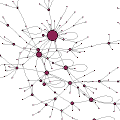
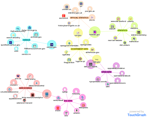
It is good, for example, that the British Sociological Association is organizing a one-day event on The Challenge of Big Data. It is a good point that members must engage with it. This challenge goes beyond the traditional qualitative/quantitative divide and the underrepresentation of the latter in British sociology. Big data, and the techniques to handle them, are not statistics, and professional statisticians have trouble with it too. (The figure below is just anecdotal, but clearly suggests how a simple search on the Internet identifies Statistics and Big Data as unconnected sets of actors and ties). The challenge has more to do with the a-theoretical stance that big data seem to involve.
Continue reading “Big Data and social research”