A paper archive – more and more often replaced by digitised versions today.
Yesterday at Biblithèque Nationale de France, I took part in a panel discussion on longue durée in history, organised by the Revue Annales – Histoire et Sciences Sociales. Of course I am not a historian, and I wouldn’t be able to tell whether one interpretation of longue durée is better than another. But historians are now raising questions that are common to the social sciences and humanities more generally: how to benefit from big data and how to re-think the political engagement of the researcher. So I was there to talk about big data and how they change not just research practices and methods, but also researchers’ position relative to power, politics, and industry. This questions cross disciplinary boundaries, and all may benefit from dialogue.
Collection of older sources is now often online and enables application of new methods.
What ignited the historians’ debate was an attempt by two leading scholars, David Armitage and Jo Guldi, to restore history’s place as a critical social science, based on (among other things) increased availability of large amounts of historical data and the digital tools necessary to analyze them. Before their article in Annales, they published a full book in open access, the History Manifesto, where they develop their argument in more detail. Their writing is deliberately provocative, and indeed triggered strong (and sometimes very negative) reactions. Yet the sheer fact that so many people took the trouble to reply, proves that they stroke a chord.
What do they say about big data? They highlight the opportunity of accessing large and rich archives and to expand research beyond any previous limitations. Their enthusiasm may seem excessive but it is entirely understandable insofar as their goal is to shake up their colleagues. My approach was to take their suggestion seriously and ask: what opportunities and challenges do data bring about? How would they affect research, especially for historians?
The recent VW emissions scandal says it all: even a large company can’t get away with behaviours that disrespect key societal values. Protection of the environment is among these values today, so much so that not only public authorities step in to defend it, but even markets punish the transgressors.
Data protection is not (yet) such a value. Admittedly, some associations, individuals, and government officials fight for it, but the larger public is still unsure. It’s not that people don’t care, but that uncertainty as to what data are actually collected, for what usages, and by whom, is overwhelming; and it becomes difficult to identify the best course of action.
In this context, a new initiative is most welcome: an open letter on “Data for Humanity“, initiated by two scholars of the University of Frankfurt, pleads for a more responsible use of data. The message is simple: Do no harm. And if you can, on top of it, do something good. It’s so simple, and so necessary.
Sure, the world won’t change after this letter, but it will be a first step. Even the promotion of environmental protection started with simple, basic declarations, 30-40 years ago; and it was by insisting and perseverating, that it finally gained the conscience of everybody.
National Statistical Institutes (NSIs) have long been the recognised repositories of all socio-economic information, mandated by governments to collect and analyse data on their behalf. The development of big data is shaking this world. New actors are coming in and commercially-oriented, privately-produced information challenges the monopoly of NSIs. At the same time, NSIs themselves can tap into digital technologies and produce “big” data. More generally, these new sources offer a range of opportunities, challenges and risks to the work of NSIs.
Fride Eeg-Henriksen and Peter Hackl introduce this special section by defining big data and emphasising its interest for official statistics. But it is crucial, albeit admittedly not easy, to separate the hype around big data from its actual importance.
The other papers are concrete examples of how big data may be integrated into official statistics:
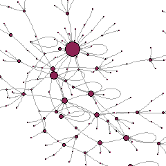
The rise of digital data, particularly data from the internet, is to be understood in social relational perspective. Online interactions – from email exchanges to use of VOIP services and participation in social media such as Facebook, Twitter and LinkedIn – make people’s social connections explicit and visible. The “social network”, once a metaphor used only in a small sub-field within sociology, is now familiar to everybody as the archetype of computer-mediated social interaction. Digital devices systematically record network structures, so that social ties become an essential part of every individual profile, and users are more and more aware of them.
One consequence of this is the booming popularity of network analysis concepts, which support the algorithms that handle digital data: for example, centrality measures are at the heart of search engine functionalities, and transitivity measures found “friend-of-a-friend” algorithms in social media. In passing, social network analysis itself which had been originally developed for small-sized, non-digital datasets (like surveys about friendship in schools) has undergone a major upgrade to account for social data from the web.
More importantly, the relational nature of digital data and the underlying possibilities to use social network analysis, open up new avenues for data collection. If user B publishes a post on, say, their Facebook wall, comments and “likes” received from their friends A, D and E will be connected to the profile of B, accessible and visible from it; in other words, it is possible to retrieve information on A, D or E through the profile of just B. In general social networks, a friend of my friend is my friend; in digital networks, the data of my friends are my data.
The “Impact of Social Science” blog of the London School of Economics has, in the past few weeks, published a series on “Philosophy of data science“. Each installment is an interview conducted by sociologist Mark Carrigan with a key contributor to the social science reflection on data.
I gave a presentation on the topic of “Data and social networks: empowerment and new uncertainties” at the Better Decisions Forum on Big Data and Open Data that took place in Rome on 12 November 2014. The event brought together six speakers from different backgrounds on a variety of topics related to data, and participants were businesspeople, public administration managers, journalists, data and computer scientists.
Here is a video of my talk:
Unfortunately as you will have noticed, the slides are not always very clearly visible, so it’s better to download them from their original source:
My interview before my talk:
See? I am trying to stick to my 1st-January commitment of blogging more this year…
How many people do you know? How many friends do you have? You may have tried to count your contacts on Facebook or other social networking websites. You may even have felt a bit weird realizing that your “real” friends — those you can rely on — are just a handful. As unexpected it might seem, business professionals have this question in mind too: they want to get a sense of the potentially useable social capital of their associates and employees.
Social research has investigated this matter intensely and can offer insight. There are, in fact, two aspects to be considered: the size of personal networks and the effects of online communication on socialisation.
The size of personal networks
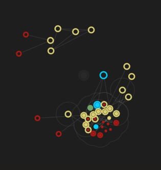
A personal network. Hollow circles represent face-to-face contacts, filled small circles represent online contacts, nested circles are both face-to-face and online. Green = emotionally intimate, blue = very close, yellow = close, red = not-so-close.
Let us first start with the size of personal networks. A milestone in this debate is the so-called “Dunbar’s number“, based on a 1992 study of Oxford anthropologist Robin Dunbar. The idea is that human cognitive capacities as measured by the size of the neocortex lead to a network size of around 148 (with some range of variation). The original study compared the size of the neocortex in various groups of primates and humans and referred to cohesive communities. The resulting limit indicates the number of people with whom one can maintain “stable” social relationships, i.e., know who each contact is, and how they are related to one another.
Other parts of the brain may be involved too, suggest neuroscientists: Lisa Barrett and her co-authors (2010) found a correlation between amygdala volume and social network size in humans. (I understand that the amygdala is the part of brain that regulates emotional responses and aggression, while the neocortex to which Dunbar referred is the part of the brain that presides higher mental functions.) (see this Blogpost for further information).
In social network analysis perspective, it is also important to define which social network we are measuring. Peter Marsden (1987) distinguished “core” networks from whole personal networks, pointing out that even when people have many friends, there are only a handful with whom they “can discuss important matters”. In this sense, core networks may not include more than five or six people. So if you thought you had very few friends, you shouldn’t feel weird after all… apparently the Portuguese have a saying, “You have five friends, and the rest is landscape.”
On the other hand, your full network also including mere acquaintances and weaker ties may be much larger than Dunbar’s: counts of full networks taken by Peter Killworth, H. Russel Bernard, Chris McCarthy and co-authors in the 1990s – 2000s went up to about 1500 for the average American. From these, they extracted more meaningful measures of networks that are really relevant for people’s daily lives and came up with other numbers: they found a mean personal network size of 290 (twice the Dunbar number!); more recently, Matthew Salganik and his co-authors (2010) have come up with an even larger size of 610 (twice Killworth’s number…).
Overall, an issue that emerges from many of these discussions is that cognitive capacities (however defined) matter primarily because they are associated with a basic limitation of all living beings –time is finite. Therefore, increasing the size of one’s personal network implies that less time is available for each contact: the size of the overall network increases, but the size of the core network doesn’t. Weak ties may gain at the expense of strong ties.
Data visualisation is still relatively uncommon in the social sciences, and is not normally expected to be part of the standard work of a scholar (contrary, some would say, to what happens in the sciences, where visualisation is sometimes necessary to figure out the properties of objects whose existence is proven, but which cannot be seen). Yet data visualisation has an extraordinary history of accomplishments even in the social realm, as cleverly documented in a forthcoming article by James Moody and Kieran Healy; and classics such as Pierre Bourdieu valued it and attempted to use it in at least some of their work, as Baptiste Coulmont interestingly reported in a blog post.
Yet the digital age offers new opportunities for data visualisation, that are largely unexploited in the social sciences. It becomes not only a tool for the researcher — to explore data prior to conducting statistical analyses, or to present results once the work is done — but also for the general user, the study subject, the beneficiary of any policy under discussion, and the general public. As theorists in the arts and digital humanities (but not much in the social sciences, I am afraid) have noticed, the Internet and all digital infrastructures are becoming today interfaces with databases, and users of all types are immersed in a world of data in a way that was unknown before. This means that data visualisations can have new and more transformative uses, empowering study subjects and people in general, by offering them intuitive and aesthetically appealing tools to better navigate this digital world. But it also involves new dangers, as to who sets the agenda and what aspects or characteristics of the data are being stressed; data are not just objective, ‘raw’ materials but mediated ones, and the choice of how to make them perceptible by the senses is not neutral.
At the annual conference of the British Sociological Association today in Leeds, in the Methodological Innovations Stream, I am presenting data visualisation work I have done with colleagues Antonio A. Casilli, Lise Mounier and Fred Pailler, as well as data visuliaser Quentin Bréant, as part of the research project ANAMIA. We developed three tools — one for data collection, one for data exploration and preliminary analysis, one as a basis for heuristics and presentation of results. The first was for our study subjects, the second for us researchers and our colleagues, the third for us and the larger public. My slides are available:
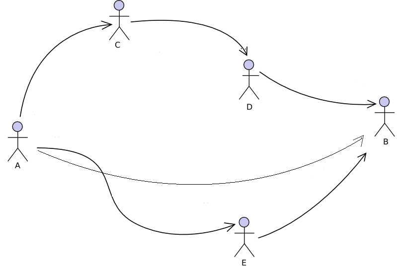
A now classical result of the sociology of social networks is the distinction between formal social structures defined by kinship, inherited hierarchy or companies’ organisational charts, and informal structures arising from nets of friendship, trust, solidarity, similarities and dissimilarities. As far back as 1954, John A. Barnes (who incidentally, is credited with coining the wording ‘social networks’) in a renowned study of a small community of fishers in a Norwegian parish demonstrated that exogenously defined positions such as those arising from political administration, economic activity or family are insufficient to explain the social structure of the community, which largely depends on less codified relationships of friendship and acquaintance. In organisational studies, it appeared that the formal chart of a company and the actual networks of advice, trust or communication of members may differ widely, and surveys aimed at eliciting network ties (with ‘name generators’ for example) became a privileged means to bring to light the ‘company behind the chart‘ (Krackhardt & Hanson 1993) and to make ‘invisible work visible‘ (Cross, Parker & Borgatti 2002). Social network scholars advised managers on how, by using employee questionnaires, they could generate network maps and get to the root of many organisational problems. Another major finding was about the emergence of informal roles – the leader, the deviant, the broker – and their important contribution to driving the behaviours and outcomes of human groups, beyond all prescribed, formal authorities (Johnson, Boster & Palinkas 2003).
The formal chart of a company and the network obtained by asking each employee, “With whom do you discuss work-related issues?” Central individuals (who receive most nominations) are NOT the formal leaders.
The research and consultancy activity that built on these ideas had a strong impact on organisational culture worldwide, especially as companies tended to flatten and rely on teams and cross-divisional, project-based work, so that managers’ authority mattered less and understanding these informal networks became a potential key for success. Many would admit today that the organisational chart is the fantasy of the employer, not an actionable tool, and even less so a reliable reflection of reality. But then, what are the advice, trust, and communication networks mapped by the researcher – shouldn’t we say they are the fantasy of the sociologist? These networks are built from questionnaires and therefore rely on the subjective responses of participants; and it is well known in the area of survey design research, that question wording orients responses, that different cultures and groups tend to interpret questions differently, and that people may give biased answers due to forgetting, deliberate concealing of sensitive information, ambiguity of definitions, and diversity in perceptions. The survey is the traditionally primary tool of investigation of the social networks scholar, but brings with it its limitations and distortions.
One may think that the formal organisational chart and the informal advice (or trust or communication) network are just two different ways of construing social structure and objectivating it. They are informed by different political and epistemological orientations: those of (old-style) employers for the former, those of social researchers (and perhaps enlightened employers) for the latter. The resulting formal-informal dichotomy would then be the result of a cleavage between two competing approaches to the management of organisations (and more generally of human groups or communities), one more hierarchical and functional, the other flatter and more collaborative.
Science, like the rest of human life, is subject to fashions. Data visualisation is the latest trend: policy-makers and the public are all under its charm, and researchers magically suspend their disbelief — give me a fancy image, and I won’t look too closely at your p-values. So I was intrigued by the discovery, at a talk few days ago by Paul Jackson of the Office for National Statistics, that there are precedents, and that they have a long history behind them.
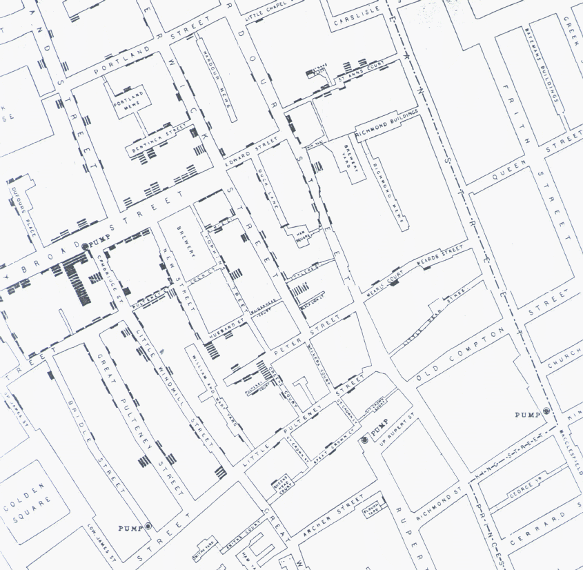
The story is that of John Snow, an epidemiologist who was persuaded, against the received wisdom of the mid-nineteenth century, that cholera does not propagate through air but through contaminated water or food. But how to convince others? When cholera struck London in 1854, Snow began plotting the location of deaths on a map of Soho: he represented each death through a line parallel to the building front in which the person died.
Snow soon realised that there was a concentration of “death lines” around Broad Street — more specifically, around a water pump at the corner between Broad and Cambridge St.
He managed to convince the authorities to remove the handle of the pump, so that people could no longer use it: in a few days, the number of deaths in the area plummeted. Snow had proven his point and saved lives: using no medical trials, no sophisticated chemistry, just with some basic count statistics, and a clever dataviz.